Sunday, November 26, 2017

GIS 4035 - Remote Sensing and Photo Interpretation - Student Spotlight

Module 10: Supervised Classification

The blog postings for Week 10 illustrated that a number of students had a good understanding of how to use Erdas Imagine to perform a supervised classification on multispectral satellite imagery.
However, Ashlee Malone's blog was especially good and stood out from the rest.  This week, we would like to highlight her excellent work!

In this lab, students were instructed to create spectral signatures and AOI features, produce classified images from satellite data, and recognize and eliminate spectral confusion between spectral signatures.  

Ashlee's blog description was well written, easy to read and outlined all the steps . She covered all the crucial steps required to conduct a supervised image classification in Erdas Imagine, including the development of training sites (using AOI layers), evaluating the training sites to limit the amount of spectral confusion, and ultimately the choice of spectral bands to include. She also included  an excellent description of both (a) the spectral distance file, which can be used to evaluate the accuracy of the classified image, and (b) the chosen classification method (maximum likelihood).  In addition to her well written blog description, Ashlee's map was well designed and easy to interpret (we especially liked her color choices for the different LULC classes). She also included the distance image itself as an inset so readers can evaluate the effectiveness of her classification. Her resulting classified image, was also once of the best we have seen. Differentiating "roads" and "urban" from using images with this level of spatial resolution (30 meters) is very difficult but her final map does an excellent job differentiating these often confused classes.  Overall, Ashlee's blog posting was excellent!


GIS 5935 - Special Topics in GIS - Student Spotlight

Module 8: Surface Interpolation

Lab 8 in Special Topics had students carrying out different surface interpolation techniques in GIS, including the Thiessen, IDW, and Spline. Also required was a critical interpretation of the results from surface interpolation techniques where students had to compare and contrast different surface interpolation techniques. This lab and the subjects is one of the more analytically rigorous topics that we cover. Comparing multiple interpolation techniques is an intermediate-to-advanced topic in GIS. Most of the student did great in this lab and were able to interpret comparative results within the context of map interpolation techniques.


In this spotlight, we would like to recognize Stuart Boyd! We have recognized Stuart’s work before, and he continues to set an example for his fellow students in the quality of work he produces.  One of the students’ final deliverables was to create a map layout of the difference between the two DEMs derived by the spline and IDW surface interpolation methods. Stuart’s map highlights his careful cartographic design choice and ability to capture/represent the analytical rigor of the methods utilized.  Notice the effective use of map insets and hue in his thematic mapping here.  Great work, Stuart!


Monday, November 20, 2017

GIS 4930 - Special Topics in GIS - Student Spotlight

Module 3: Analyze Week

This week's blog spotlight is from Special Topics in GIS.  For Module 3's Analyze Week, students were to perform Ordinary Least Squares (OLS) regression analysis on various independent socioeconomic variables for West Virginia in an attempt to define a statistical model that could help law enforcement agencies identify areas of potential meth lab locations (the dependent variable). 


This week, we would like to highlight the outstanding work of Adam Edumundson!


His blog post, in clear, cogent language, defined the complex methodology of this week's efforts while adding in some humor to make it a very approachable fun read for GIS and non-GIS professionals alike.  Adam has always turned in work that had light-hearted comments that gave insight into his various methodologies, and this blog post is no different!  Great job, Adam!


Wednesday, October 25, 2017

GIS 5935 - Special Topics in GIS - Student Spotlight

Module 8: Lab 3

Lab 3 in Special Topics (GIS5935) had students comparing the quality of two different road networks. They used standard methods determine the completeness of road networks according to an ad-hoc methodology. There is no standard for completeness, but the methodology used here is like the one used in several of the assigned readings (e.g. Haklay, 2010). One of the students’ final deliverables was to illustrate their findings within a single map, which required some creativity and advanced cartographic techniques such as a diverging color ramp.


This week, we would like to recognize Joanne Starr! Joanne comes to UWF GIS with a BA in archaeology from the University of Evansville and an MA in anthropology from the University of Arkansas. Along with the effective use of a divergent color ramp, Joanne’s map also utilizes two different insets to highlight and give context to her map. Follow her progress on her blog at http://joannesgisblog.blogspot.com/.


Thursday, October 19, 2017

GIS 4035 - Remote Sensing & Photo Interpretation - Student Spotlight

Module 3 - Land Use/Land Cover (LULC) Classification 

For Week 4 in GIS 4043, students were instructed to locate and identify features using Google Maps street view, construct an unbiased sampling system, and calculate the accuracy of Land Use/Land Cover classification maps.  

The blog postings for Week 4 illustrated that a number of students had a good understanding of how to conduct an accuracy assessment on a LULC classification. However, this week, we would especially like to highlight Daniela Sabillion!

Her blog post is easy to understand, provides an excellent overview of the accuracy assessment techniques learned in this week's Module, and demonstrates a high level of understanding of the material. Daniela provides a brief review of the two main types of accuracy assessment: in-situ and ex-situ.  Despite not having the highest accuracy (which has a lot to do with the differences in scale of the imagery vs the scale of the ground truthing), her blog post provides a good description on how she developed a stratified random sample using a fishnet grid created in ArcGIS. In addition to the description, she also provided graphics of both (a) different sampling methods and (b) her table of sampling points with accuracy assessment (yes or no) with notes. These additional graphics greatly assist with interpreting the process she used for conducting the accuracy assessment.  

In addition, her map demonstrates a keen design. It is easy to read, the map elements are extremely well balanced, and the colors she chose make it very easy to distinguish the different LULC classes.  Overall, Daniella's blog posting was very good!


Tuesday, October 17, 2017

F2F GIS 4043 Lab - Introduction to GIS - Student Spotlight

Module 4: Sharing GIS Maps and Data


In this week's face to face GIS 4043 Lab "Sharing GIS Maps and Data", attention is shifted to designing for web maps vs paper maps.  Specifically, students learn how to share GIS maps and data with others as a KMZ file accessible through Google Earth and as a map package viewable on ArcGIS Online or Desktop.  Both results can be easily shared with others via email or similar.  Students were asked to develop their own "Top 10" list/rank of locations of their choice, map, and then share.

This week, we would like to highlight the outstanding work of Adam Gustafson

We liked how Adam researched his top ten list topic and chose a topic that hits close to home. He provides background information and methods on his blog post so others could duplicate the project if they wanted. Pensacola is ranked #8 on water quality scale. Check out his post to learn more.


Sunday, October 15, 2017

Online GIS 4043 Lab - Introduction to GIS - Student Spotlight

Module 3: GIS & Cartography


The goal of this week's lesson in Introduction to GIS is to present some fundamental cartographic design principles that will help you produce more accurate and aesthetically pleasing map products using a GIS.  Fundamental map design elements are described that can lead to high-quality cartographic products (e.g., layout, balance, use of color and symbols, the figure-ground relationship, north arrows and compass roses, scale bars, metadata). Detailed information about mapping point, line, and area features using a GIS are presented with examples. Students created three maps of Mexico this week, implementing cartographic design principles. 


This week, we would like to highlight the outstanding work of Jason Lewis

Jason created a nice set of maps this week that combined everything we've covered in class so far. We really like his color choices and labels that all easy to read and understand​.


Wednesday, October 4, 2017

GIS 4930 - Special Topics in GIS - Student Spotlight

Module 1: Project 1 Report Week

During the first 3 weeks of Special Topics in GIS, undergraduate students completed preparation, analysis, and reporting on (at the time) hypothetical hurricane evacuation routes for Tampa, Florida using ArcMap’s Network Analyst extension. Local, state, and federal governments work together to manage disaster relief and rescue operations. After identifying storm surge zones and potentially flooded roads, students presented these routes as maps within useful pamphlets for hospital patients and their families, for supply routes to shelters, for use as flyers to evacuate downtown Tampa, and as chyrons for local news stations. While preparing their work, Hurricane Irma formed and struck the exact area of interest for this project; students were able to show just how important these spatial analytics are in saving lives.

This week, Special Topics in GIS would like to spotlight Rachel Gwin’s amazing work. In her blog, she created a great flyer detailing the routes downtown Tampa citizens could take to their designated shelter as well as providing a professional chyron for use on network television. Her flyer is well-constructed and easy to read, making her work perfect for the intended audience. Her chyron matches evacuation zone colors with the color of font used to describe each shelter location, as well as providing in-depth instructions on what to bring and what to avoid. The blog itself does a good job detailing what each of the four deliverables entailed. Fantastic work, Rachel!

Wednesday, August 16, 2017

GIS 6110: Advanced GIs Final Project

GIS 6110: Advanced GIs Final Project

During Advanced Topics in GIS, students learned about SQL database technologies and Web GIS, which included HTML, server-side scripting via PHP and Python, mapping APIs and MapServer. For their final project, students were asked to take a typical desktop GIS workflow and put it online in prototype or pilot form. Students were then asked to record a demonstration of their project.

This week, we would like to highlight the outstanding work of Samuel Song! Samuel's project was chosen due to his excellent utilization of concepts learned throughout the class and presentation.


Unable to display content. Adobe Flash is required.

Thursday, July 20, 2017

GIS 4048 - GIS Applications - Student Spotlight

Module 7Minimum Essential Dataset (MEDS): Protect

The MEDS protect lab wrapped up our investigation of GIS in homeland security and law enforcement.  This was a two part lab, with students first compiling and preparing a Minimum Essential Dataset for the Boston Metropolitan Statistical Area, then using the MEDS to identify critical infrastructure, define security checkpoints, and set up clear view surveillance points in the vicinity of the Boston Marathon finish line location.


This week, we would like to highlight the outstanding work of Andrew Stevens!


Andrew did a great job compiling the critical infrastructure and surveillance maps.  The infrastructure map utilizes military template with an easy to use grid to facilitate ease of finding features.  The checkpoint inset map provides street labels so checkpoint locations are easily understood.  The locator inset map is set to the appropriate scale so the user easily understands where in Boston the event zone is located. Local level roads are included in the map, which is important as the Boston Marathon occurs on this street network, but the roads are symbolized subtly so the information does not overwhelm the map.  The surveillance map provides street information and incorporates enough transparency to see the aerial imagery beneath the viewshed dataset.  Each surveillance point is located by number and associated surveillance elevation height that will allow a clear line of sight.  The LOS with the most obstructions is presented in a graph so it is clear where the obstacles are located.  And again the locator inset map is set to a scale that communicates where in Boston this area is located.  

Excellent work Andrew!

Thursday, July 6, 2017

GIS 4048 - GIS Applications - Student Spotlight

Module 5: Crime Analysis

The Washington D.C. Crime Analysis lab kicked off the Homeland Security and Law Enforcement topic.  Students utilized crime data from the DC Metropolitan Police Department to determine crime patterns in proximity to police stations and to identify underserved area(s) potentially in need of a police substation to curb crime.  Additionally students utilized density analysis to locate hot spots of certain crimes.


This week, we would like to highlight the outstanding work of Adam Edmundson!


Adam’s crime analysis map stood out as a spotlight for its crisp and clear presentation and the ease to which it communicates results.  The range graded police shield symbols are classified and symbolized for quick data acquisition--it is clear at a glance which police stations handle the most crime.  The numeric station labeling adds additional information without crowding the map. The added subtext on the map provides useful information such as an overview of DC crime patterns, the location of the proposed substations and why.  The crime graph easily communicates the crime dynamics of city. Overall, excellent page layout and map organization.

Excellent work Adam!

Monday, July 3, 2017

Happy 4th of July!


Whether you are celebrating with fireworks cookouts or studying, we hope you have a great 4th of July holiday! 


Did you know?
  • There are thirty-one places nationwide with "liberty" in their names. The most populous is Liberty, Missouri with 29,581 residents. The state of Iowa boasts four such towns, which is more than any other state: Libertyville, New Liberty, North Liberty, and West Liberty.
  • Thirty-one places are named "eagle" after the majestic bird that serves as our national symbol. The most populous community is Eagle County, Colorado, with a population of 51,359, then Eagle Pass, Texas, with 26,401 residents.
  • Twelve places have "independence" in their name. The most populous of these is Independence, Missouri with 109,400 residents.
  • Nine places adopted the name "freedom," including Freedom, California, with 6,000 residents.
  • There are five places in the country that are named "America," the most populous being American Fork, Utah, population 25,596.
  • There is one place named "patriot" - Patriot, Indiana, with a population of 195.

Tuesday, June 27, 2017

GIS 5103 – GIS Programming - Student Spotlight

Module 6: Geoprocessing


In module 6 GIS Programming (GIS 5103) students built on the previous weeks lab of geoprocessing with ArcGIS ModelBuilder, by considering how to automate workflows directly with Python scripting. For the assignment, students write a script that performs three separate geoprocessing functions: adding xy coordinates, creating a buffer and dissolving spatial features. As is required by all labs, students complete a flowchart depicting the logical flow of their scripts.  

This week, we would like to highlight the outstanding work of Robert “Taylor” Moore. Taylor’s flowchart is shown below illustrating how his script accomplished the three geoprocessing tasks:

Taylor successfully completed all parts of the assignment and the associated quiz with distinction! His blog post is extremely detailed and something to be proud of. He did a great job describing the steps taken to complete this module including an informative flowchart that used the correct standard symbols illustrating the steps he took to automate the geoprocessing steps. 

Taylor is currently work as an Environmental Specialist for a small consulting firm based at Camp Lejeune Marine Corps Base. In a recent weekly virtual session Taylor discussed a potential topic for the end-of-semester project focused on automating via Python geoprocessing task for a work-related project. This is very exciting because we love to see students taking what they learn in the classroom into real work applications. We look forward to watching Taylor’s continued success with GIS. 

Wednesday, June 14, 2017

GIS 4048 – GIS Applications - Student Spotlight


Module 2: Lahars

The first GIS application investigated in GIS 4048 is Natural Hazard planning and mitigation.  For the lahars lab, students utilized DEMs and the Hydrology toolset found within the Spatial Analyst extension to determine potential drainage flow around Mt.Hood in a potential volcanic event.  After streambeds  were determined, students overlaid census data to determine the at risk population.  Lastly, the data was compiled as a cartographically polished map to effectively communicate the information.

This spotlight goes to Erin Padgett! Erin correctly completed the DEM analysis to generate streams and adjacent low lying hazardous areas.  Although the analysis workflow was tricky, presenting the information was equally as difficult.  Erin did an excellent job differentiating map elements and information to allow for quick data acquisition and interpretation.  The excellence is in the map’s simplicity.  The underlying DEM imagery was phased out for a neutral background a few shades lighter than the symbology for the hazard areas which really promoted the map’s content. The different label styles are simple, but very effective at communicating different features. Overall, this map’s generalized content enables quick acquisition of the hazard areas. Including DEM imagery in the map could also be relevant, but the trick is to use subtle symbology so the hazard areas are still easily visible.  See her blog post for more details about this assignment. Great job Erin!


Monday, May 15, 2017

Summer is here!

Summer is here and the GIS at UWF team has hit the ground running! 

Certificate program students have the option of enrolling in GIS Programming (GIS 4103/5103) and GIS Applications (GIS 4048/5100). Summer also marks the beginning of our graduate level certificate courses and a great time for all students to start thinking about internships. We are happy to report that we have an outstanding bunch of students registered and we can’t wait to share their hard work and growth through the student spotlights. You will begin seeing weekly spotlights starting next week. In addition to spotlights, we plan to also post MOOC updates for the next few weeks. It’s nice to be back blogging – we’ve missed you!

Today also marks the first day of our Introduction to GIS MOOC (Massively Open Online Course). There is still time to register if you are looking to refresh your GIS skills or simply find out what MOOC’s are all about. We welcome all current students, alumni and friends to "summer" with us!

Wednesday, April 5, 2017

GIS6005- Communicating GIS - Student Spotlight

Module 6: Choropleth Maps

During week 6, students explored choropleth mapping. This is the most widely used type of thematic map for quantitative data. Choropleth maps are used for normalized data - in contrast to proportional symbol maps which are used for total counts. Choropleth maps are also one of the most complex type of maps to design. You have to make decisions on normalization, classification and color ramps, among other things. Different design decisions can result in a very different map for the same data, so more than ever it is important to be aware of your design process. 

We would like to specifically recognize Jeremy Mullins for his excellent cartographic work in this module and the class so far. In addition to his lab deliverables being professional and well organized, he has shown an eye for creativity and critical thinking. This makes Jeremy’s work stand out because good cartography is both an art and a science. For example, in the choropleth lab title choice for a population change map of Georgia draws the map readers in by providing a slightly-tongue-in-cheek, but geographically accurate, description of the maps’ purposes.

Jeremy’s blog post is also well written and shows the corresponding maps he has produced for each lab. 

Jeremy is a Graduate Teaching Assistant for the GIS Certificate Program and we are so happy that he chose UWF! Keep up the great work Jeremy!

Friday, March 31, 2017

GIS 3015 – Cartographic Skills - Student Spotlight


Module 9: Flowline Mapping


Module 9 required students to undertake Flow Line Mapping. Flow maps utilize lines of varying width to depict the movement of phenomena between geographic locations. Students utilized Adobe Illustrator to create a distributive flow map to illustrate global immigration figures into the United States. Lab materials provided base maps produced in ArcMap, and left students with the task of rearranging continents and creating proportional flow lines and corresponding legends in accordance with design principles.

The spotlight this week goes to Rachel Gwin! Rachel’s flow line map stood out for its clear presentation of data. Her systematic map organization and inclusion of supplemental information information is the map’s selling point. Flow lines and U.S. immigration data stand out above all other map elements. The map’s design demonstrates a competency with Adobe Illustrator--the flow line styling and placement is subtle yet effective, the corresponding line and continental colors facilitates easy map interpretation. The choropleth legend has contiguous legend swatches in keeping with textbook choropleth legend design. The horizontal legend orientation is ideal for legend placement within available map space. The map elements are balanced throughout the page, with all objects being sized appropriately for easy viewing. Map information provides correct data sources, projection as well as other helpful information to aid in correct map interpretation. See Rachel's blog post for more details about this assignment. Excellent work Rachel!!


Tuesday, March 28, 2017

Student and Professional GIS Competitions

The GIS industry is full of student and professional competition opportunities. Here are a few upcoming opportunities that we would like to share:
If you aren't sold on participating, here are just a few reasons why you should at least think about it.


If you know of another GIS competition, please email gisonline@uwf.edu with details so was can feature it on our blog and Facebook pages.


Friday, March 3, 2017

GIS6005- Communicating GIS - Student Spotlight

Module 3: Typography

Communicating GIS is a course within our M.S. in Geographic Information Science  Administration (GIS) degree plan. This course begins with the basic theory of graphic design, cartography, and map production and distribution. Students then learn to communicate specific types of spatial and analytical information through maps, written and oral explanations, graphs, tables, charts, and interactive web mapping applications. 

During week 3 in GIS 6005- Communicating GIS, students learned about using effective type as part of effective map design. Well-designed and implemented type is a very important component of the professional appearance and clarity of maps. Therefore, a review of the basics of typography, as well as some widely used approaches to use type effectively to enhance maps was covered in this module.  The lab for the module had students experiment with different typographic styles and apply type choices within overall map design. 


We would like to specifically recognize Edward Walther for excellent typography work on the maps produced for module 3. We should also mention that in week 4 of Communicating GIS Edward led a discussion on the usage of color in Cartography, where he very effectively discussed the differences in categorially data types and color scheme usage within cartography.  

Edward has been a pleasure to have in the class.  Edward works as a project manager for the South Florida Water Management District specializing in water quality. Mr. Walther's previous work experience in Delaware had him developing suitability tools using GIS to explore alternatives for waste water. His education and experience has served him well in Communicating GIS this semester. In the final deliverable of the lab, students brought together the labeling of the cities, states and rivers of Mexico. Edward’s map provides a great example of effective typography for a variety of different map features and strong overall map presentation. 

Great work Edward!

Friday, February 24, 2017

GIS 3015 – Cartographic Skills - Student Spotlight

Module 4: Cartographic Design

Module 4’s lab was the culmination of cartographic design content.  Student’s learned about the Gestalt Principles of perceptual organization, focusing on the concepts of visual hierarchy, contrast, figure ground distinction, and map balance.  The assignment involved creating a map of schools in Ward 7 of Washington D.C. Design concepts were to be utilized to place Ward 7 schools at the top of the map’s hierarchy, while relegating base information, such as roads, to the background.

The spotlight this week goes to Billy Heiden! There were many aesthetically pleasing maps to choose from, however, Billy’s attention to design concept details set his map apart from the rest. Contrast and figure ground is implemented by making Ward 7 the lightest shade in the map, thus appearing closer to the reader and establishing the desired visual hierarchy. The color scheme allows background information to be seen but not overpower, again pulling the eyes to Ward 7 and the schools. The correct level of detail is provided for each region of the map.  In Ward 7, he included finer detail with the DC Streets layer, moving out to the greater D.C. area, only primary transportation routes are included so as not to pull the eye away from Ward 7 and overcrowd the map with superfluous information. Intuitive symbology is applied so that the legend only needs to contain the School layer.   The extent of the map is clearly indicated in the Locator Inset.  Map Balance is achieved by carefully taking advantage of empty map space, ensuring not to bunch elements together or place them in too small of an area. See Billy's blog post for more details about this assignment. Great work Billy!


Tuesday, February 14, 2017

Happy Valentine's Day from GIS Online @ UWF


Make a connection with GIS and celebrate Valentine's Day the Geographer's way! Here is a list of great "mappy" resources to make your Valentine's day memorable.

Friday, February 10, 2017

GIS 4043L – Introduction to GIS Lab - Student Spotlight

Lab 2: Own Your Map!

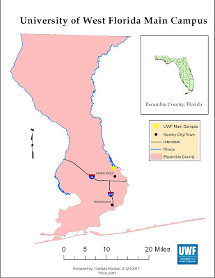
The "Own Your Map" Lab encourages students to think creatively when designing their maps. Setting all the essential map elements are key, but creating a map that looks nice and is geared toward your specific audience (the public, customers, etc.) can be challenging.

The spotlight this week is Chelsea Randall! Chelsea's map is well organized, easy to read, and all of the map elements are proportional to each other. None of the map elements are distracting (i.e. North arrow to large, UWF logo awkwardly placed, or city names overlapping roads). Her blog post does an excellent job of discussing the assignment. Great job, Chelsea!


Friday, February 3, 2017

GIS 3015 – Cartographic Skills - Student Spotlight

Module 2: Introduction to CartoGraphic Design with Adobe Illustrator

Module 2’s lab assignment reinforced introductory map design concepts learned in the previous week by allowing students to draft their first map of the class.  The assignment involved creating a basic map of Florida for a children’s encyclopedia.  However, the difficulty of the task  was related to learning and using graphic design software Adobe Illustrator to leverage the map content generated by ArcMap to create a publishable quality end product.

The spotlight this week is Daniella Sabillon! Daniella nailed this assignment by creating a clear and crisp map of Florida using both ArcMap and Adobe Illustrator.  She correctly clipped and displayed Florida’s surface water by category with intuitive color choices.  Daniella effectively ran the provided script in Ai to replace all ArcMap generated city symbols.  Three state images were added to the map, and a drop shadow was utilized to help the content stand apart from the page.  Map space is effectively utilized and the user friendly scale bar promotes quick and easy data acquisition.  Lastly, Daniella’s blog post does an exceptional job introducing the assignment and discussing key skills and processes used to create her map!  Nicely done Daniella!!


Friday, January 6, 2017

5 Tips to Succeed in an Online Course


Confirm technical Requirements:
Online classes can benefit students with busy schedules, but only if they can access the materials. GIS Online students should be sure to review the
eLearning Guide for Students and the Software Access and General Overview pages for details about how to prepare for class. Also ensure your Internet connectivity is sufficient (broadband is strongly recommended).

Connect with instructors early: Help is available but it takes time for instructors to answer emails or discussion posts. Questions about assignments should be brought forward early so answers can be provided before assignments are due. Try to find answers to general course questions in the course syllabus or general discussion boards before contacting the instructor with your question. 

Create a schedule: GIS Online courses are designed using Quality Matters Program course design principles to ensure students can quickly identify the learning objectives, assignments and deliverables. Be prepared to review materials early and plan out several two-to-three hour time blocks to log in and complete weekly assignments. Creating a schedule helps students stay on track. 

Stay organized: Transfer important dates from the syllabus to a personal calendar at the beginning of the semester. Use internet browser bookmarks for important sites you visit regularly (MyUWFDesktop for example). Set course notifications in eLearning to receive notifications of changes, updates and deadlines to a personal email account. 

Have a consistent workspace: GIS Online courses may require books, printouts, draft papers, and other loose items. Keep all of these items together, in one place. If not a desk or file cabinet, perhaps some folders in a milk crate? Have some “Plan B” locations in mind in case the normal workspace is somehow compromised or is no longer conducive to learning.